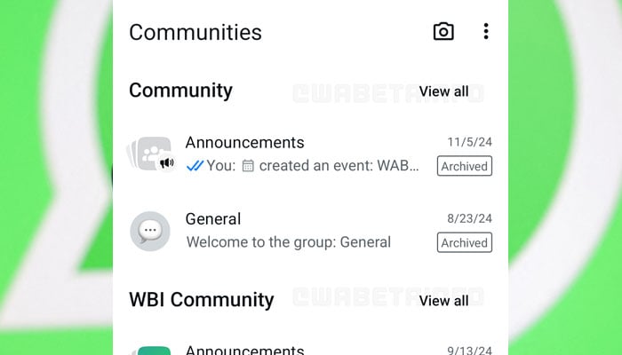
A report revealed that with the introduction of the new change, WhatsApp wants to make the interface easier to understand for the users, allowing them to quickly navigate through the Community or group chat.
This will also shrink the space occupied by each section on the screen.
Earlier, due to occupation of large portion of the screen by each section, the users had to navigate through a long list to point out a specific Community or group chat earlier.
The updated design reduces this trend and helps users reach their destination with ease by displaying more Communities on a single page.
Furthermore, every section will still see the recent group chats as it gives users a quick view option of the latest activity in each Community.

It is pertinent to mention that for making navigation more convenient, the Meta app has launched a dedicated button next to each Community name, allowing the users to view all the group chats linked to that Community in a single tap.
As of now, the new Communities tab update is available to some beta testers and it is rolling out to even more people over the coming days.


